Unit 78 Task 3: Be able to create digital graphics for a computer game following industry practice.
After researching and drawing my character and environment as you saw in Unit 78 Task 2 I had scanned my pictures to the computer so I could trace them using Adobe Illustrator. And it look like that:

I used Stroke level on 1pt on everything, I was thinking about using 0.5pt on hair but did colored it on black so it didn't matter. To trace it I have used mostly "Pen tool" and sometimes "Curvature tool" to edit my trace in case of error.

The thing you see on the left hand side are my palette colours that I did prepared before colouring.
I had set of colours that I used to colour my character in different brightness level so I could use it for shadows on the character.
To be able to make this "different brightness level" effect I had to make one square with one bright level color and second, on the bottom with much darker level color.

Then I went to Object menu on the top corner and to Blend option and clicked Make while both squares were selected. Then all I had to is to set number of squares between those two.
If you are interested I have named everything I traced except small parts or lines but, most important ones I named in to help me in coloring it and in case I need to find it quick.
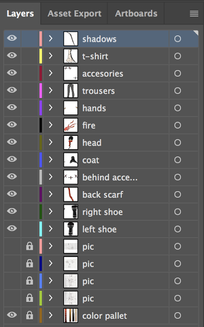
After tracing it I have added colors copying them from palettes I talked about. I used "eyedropper tool" to be able to copy colors from palettes each time; the shortcut for this is "I" on the keyboard making my work very efficient.


<----------------------------------------------------
I used Stroke level on 1pt on everything, I was thinking about using 0.5pt on hair but did colored it on black so it didn't matter. To trace it I have used mostly "Pen tool" and sometimes "Curvature tool" to edit my trace in case of error.
The thing you see on the left hand side are my palette colours that I did prepared before colouring.
I had set of colours that I used to colour my character in different brightness level so I could use it for shadows on the character.
To be able to make this "different brightness level" effect I had to make one square with one bright level color and second, on the bottom with much darker level color.

Then I went to Object menu on the top corner and to Blend option and clicked Make while both squares were selected. Then all I had to is to set number of squares between those two.
If you are interested I have named everything I traced except small parts or lines but, most important ones I named in to help me in coloring it and in case I need to find it quick.

After tracing it I have added colors copying them from palettes I talked about. I used "eyedropper tool" to be able to copy colors from palettes each time; the shortcut for this is "I" on the keyboard making my work very efficient.
<----------------------------------------------------
And right now my character look like that:

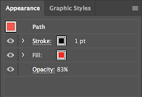
Yes, I have made the fire on the eye a little bit transparent my decreasing opacity to 83%:
For my second side(left side) all I had to do was to make a copy from my right hand side and flit it horizontally; remove eyes and put longer hair that covers the eyes. Also I had to edit my fire on the eye so it actually is on left eye.
Next part to trace and actually create was my environment for my already made character so there is a little bit of story and challenge. So my environment looks like this:
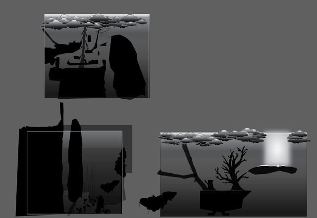
I have divided my environment into three peaces to make it more clean and easier to edit for me.
Also as I have talked about before in Unit 78 task 2 I have made the map more style like in Limbo due to lack of textures, clouds, trees, grass, some stones I have traced from my researched images I showed in my mood board in Unit 78 task 2; of course after tracing them I edited, scaled and rotated to make it mine own original so it fits my need and surrounding that object is going to stay.
My environment is quite big and dark so I will show it more zoomed in:
First part (album):
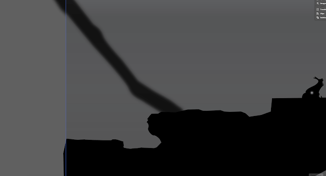
The little thing with the small source of light inside on the right hand side, is save point for the game.
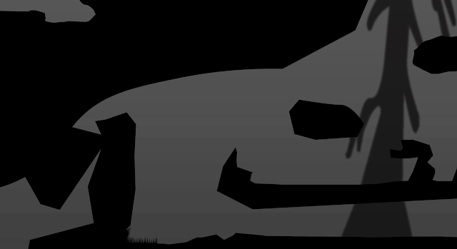
There are spikes on the left bottom if you haven't noticed; they are there to show that there is possibility of danger and even death.
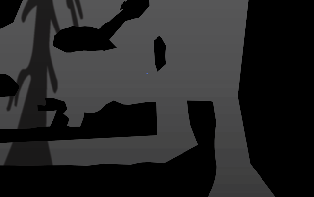
On the right hand side the character will fall dawn moving into second album.
Second part (Album):
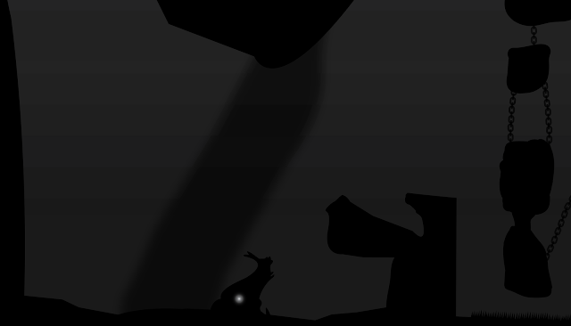
You drop down falling next to the save point.
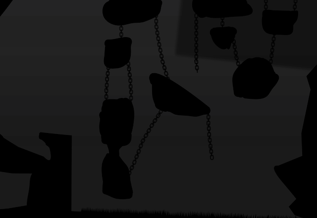
Next stage is to do a little bit of parkour to train user mobility skills; fall means death as there are spikes on the bottom.
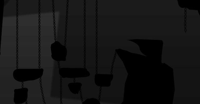
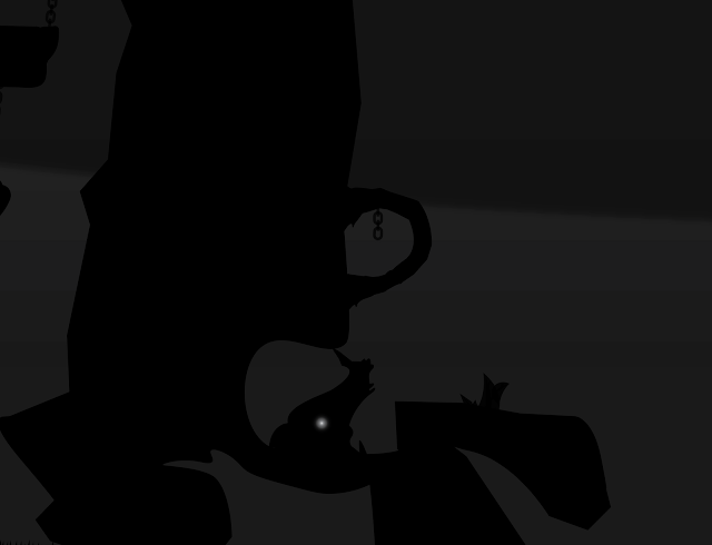
There is a little secret place where is save point giving the game more interest making the user to look around the environment to find different secret places that might be added later on.
After finishing the little parkour you climb making way up to the third album.
Third Part (album):
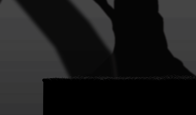
From one of the rocks you will be making huge jump to this place where you can't go back.
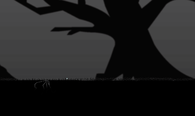
This place will be some king of boss fight but I don't have boss made yet so there is quite empty space with a lot of grass on the ground.
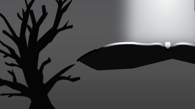
After defeating the boss you can go climb on the tree to the floating platform where is a magic cube(at the moment) light up by the sun on the single spot as there is no clouds on the top. And this is purpose of the journey that the character need to make.
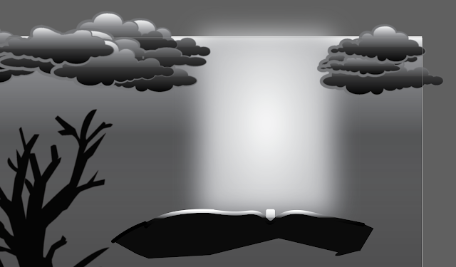
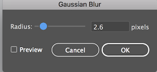
For all the background objects that doesn't take physical part in the game I used Gaussian blur.
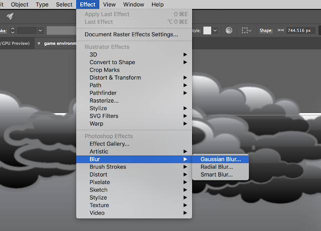
And I set up radius on about 2.6 pixels.
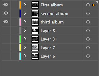
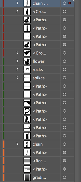
I have separated and named all the albums so it is clean and easily to find all the stuff when editing. Of course in side every thing is named and ordered in right place. I tried to keep an eye on naming and the meaning of it all the time.


Comments
Post a Comment